Infographics & Data Visualization
Infographics DefinedInformation graphics or infographics are graphic visual representations of information, data or knowledge intended to present complex information quickly and clearly.
They can improve cognition by utilizing graphics to enhance the human visual system’s ability to see patterns and trends. The process of creating infographics can be referred to as data visualization, information design, or information architecture. |
Big Data DefinedBig data is a collection of data sets so large and complex that it becomes difficult to process using on-hand database management tools or traditional data processing applications.
The challenges include capture, curation, storage, search, sharing, transfer, analysis, and visualization. The trend to larger data sets is due to the additional information derivable from analysis of a single large set of related data, as compared to separate smaller sets with the same total amount of data, allowing correlations to be found to "spot business trends, determine quality of research, prevent diseases, link legal citations, combat crime, and determine real-time roadway traffic conditions." |
Link to Thirteen Reasons Why Your Brain Craves Infographics
Neomams 12 Types of Infographics Ebook
| neomams-12-types-of-infographic.pdf |
Please include attribution to BenchmarkEmail.com with this graphic.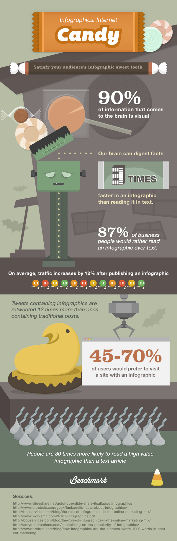
> DAVID MCCANDLESS | The Beauty of Data Visualization
davidmccandless.com
"By visualizing information, we turn it into a landscape that you can explore with your eyes, a sort of information map. And when you're lost in information, an information map is kind of useful."
TED Global | July 2010 | Oxford England
|
Hello. I’m a London-based author, data-journalist and information designer, working across print, advertising, TV and web.
My information design work has appeared in over forty publications internationally including The Guardian, Wired and Die Zeit. In recent years, I’ve been exploring the use of data visualisation and infographics to explore new directions for journalism and to discover new stories in the seas of data surrounding us. The result is my blog and book Information Is Beautiful (HarperCollins 2009). It’s dedicated to visualising ideas, issues, knowledge and data. I started my career as a writer for cult video games magazines in the late 80s, hacking into games and penning a programming column. Over the next 25 years, I worked as a journalist, conceptual copywriter, web editor, creative director and comedy writer. My work these days merges data, concepts, visual design and story-telling – and the odd joke. I’ve had pieces exhibited at the Museum of Modern Art in New York, the Wellcome Trust gallery in London, and at the Tate Britain. I have an occasional column on the Guardian Datablog. Enjoy! David |
|
> Resources for Looking at and Creating Infographics


10 Tips to Create Useful and Beautiful Visualizations | PDF
|
Download How to Create 5 Fabulous Infographics PPT Templates
| ||||
> Web 2.0 Infographic Design Tools

10 Free Tools for Creating Infographics | Creative Bloq
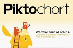
PiktochartHave graphics tell a story from your information. Infographics are an awesome way to tell stories out of data. With a lite set of professional design tools, Piktochart helps you create wow presentations to engage your web audience. Combine themes, shapes, icons, vectors, text, uploaded images, chart exporter (8 types of visualizations) to create the story you want.
piktochart training on youtube |

Easel.lyThis free web-based infographic tool offers you a dozen free templates to start you off, which are easily customisable.
You get access to a library of things like arrows, shapes and connector lines, and you can customize the text with range of fonts, colours, text styles and sizes. The tool also lets you upload your graphics and position them with one touch. |

Infogr.amInfogr.am is a great free tool which offers access to a wide variety of graphs, charts and maps as well as the ability to upload pictures and videos to create cool infographics.
Customising the data that makes up the infographic takes place in an Excel style spreadsheet and can easily be edited, watching the software automatically change the look of the infographic to perfectly represent your data. When you're happy with your infographic you can publish it to the Infogram website for all to enjoy and even embed it in to your own website or share it via social media. |

VenngageEverything you need to create and publish info graphics including hundreds of charts and icons, simple drag and drop, interactive and engaging, beautiful templates and themes.
|
Visual.lyVisual.ly is a community platform for data visualization and infographics set up in 2011. It allows you both to create infographics and get them shared on social media. The website is also able to match those commissioning infographics - including brands, companies and agencies - with its community over more than 35,000 designers.
|

iChartsThe iCharts service provides a hosted solution for creating and presenting compelling charts for inclusion on your website. There are many different chart types available, and each is fully customisable to suit the subject matter and colour scheme of your site. Charts can have interactive elements, and can pull data from Google Docs, Excel spreadsheets and other sources. The free account lets you create basic charts, while you can pay to upgrade for additional features and branding-free options.
|

Wolfram AlphaBilled as a "computational knowledge engine", the Google rivalWolframAlpha is really good at intelligently displaying charts in response to data queries without the need for any configuration. If you’re using publically available data, this offers a simple widget builder to make it really simple to get visualisations on your site.
|

Tableau Public
Tableau Public is a free tool that brings data to life.
Ready to start visualizing your data? Download Tableau Public then visit our Training page for resources to help you get started. WINDOWS OMLY |
> Interactive Data Visualizations
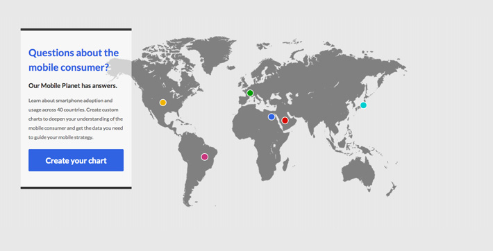
Google GoMo
|
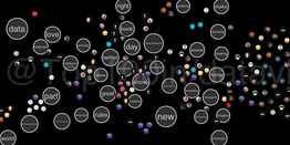
NeoformixSpot Twitter VisualizationNeoformix is a company that provides services in the creation of custom data visualizations and generative design.
We are currently available for new projects so contact us through Email or Twitter if you are interested. Neoformix is based in Toronto but our clients are world-wide. Selected projects are shown on this page or have a look at the Blog to see the latest updates |
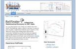
Visual Data Web RelFinderAre you interested in how things are related with each other? The RelFinder helps to get an overview: It extracts and visualizes relationships between given objects in RDF data and makes these relationships interactively explorable. Highlighting and filtering features support visual analysis both on a global and detailed level. The RelFinder is based on the open source framework Adobe Flex, easy-to-use and works with any RDF dataset that provides standardized SPARQL access.
|
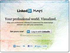
Linkedin MapsIf you’re a LinkedIn user, you already know the power of your professional network.
What if you could visualize what your network looks like? Would your connections form clusters or groups? Wouldn’t it be great if you could see the way all your connections are related to each other? Even be able to identify the elusive hubs between your professional worlds? Now, you can! This week, we’re introducing a new LinkedIn Labs product, called InMaps. More after the jump. |
Pitch Interactive
Pitch is a multi-faceted and interactive data visualization studio in San Francisco focused on bridging the gap between form and function.
|
> Teaching Infographic Design
Infographic Assignment by Dr. Gee Ekachai
Department of Stratgeic Communication, Marquette University
| Infographic Assignment |
Teaching Infographic Design With Piktochart by Patrick Johnson
Diederich College of Communication Grad Student
Information Graphics | Data Visualization Ethics
by Emily Yount | Milwaukee Journal Sentinel
presented to Media Ethics | April 2013
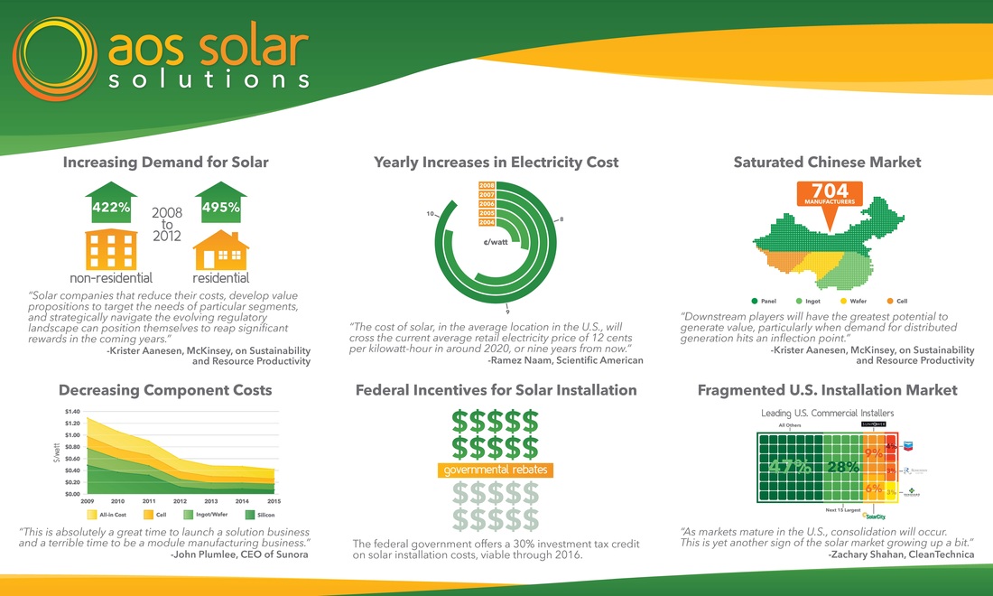
Student Infographic Design by John Grossman
This infographic was designed by College of Communication student John Grossman in collaboration with College of Business student Michael Mack. This poster size infographic was created for Michael's AOS Solar Solutions startup pitch made at the 2013 ImpactNext Business Plan Competition at Marquette University.
The infographic was created using Adobe Illustrator and InDesign software.
The infographic was created using Adobe Illustrator and InDesign software.